1.10. Pivot Tables

1.10.1. Getting Started…
Note
In this exercise, we will be working with the data found in CarAccidents.xlsx.
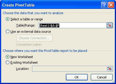
To invoke the PivotTable wizard in Excel, first highlight the data that you want to summarize. Select Insert > PivotTable or PivotChart. The PivotChart will produce a table as well as a chart; whereas the PivotTable will produce only a table.
In the Create PivotTable window, you must specify the data that you want to analyze and a location for the output (or report) to be placed.
On the new sheet, you will see an output area for the table and the chart; also, a PivotTable Field List is shown on the right-hand side of the window. To create your table and chart, place your first variable of interest in the Axis Fields box near the bottom right corner of the window.

For example, suppose the variable of interest is Gender. To create a pivot table for Gender, first place Gender in the Axis Fields box. Next, you must tell Excel what you want to do with Gender. Dragging Gender into the Values box will create a Count of Gender.
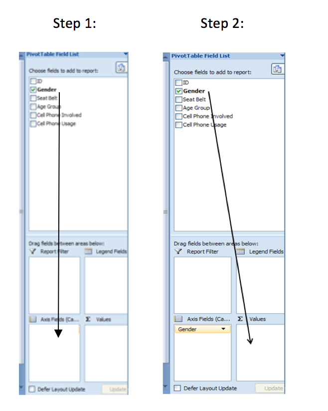
To obtain a summary of the distribution of Gender, this variable should be placed in the Axis Fields box and a Count of Gender should appear in the Values box as is shown below.

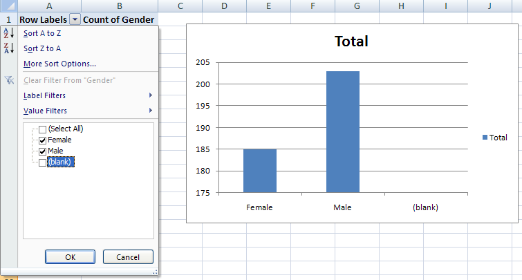
The table of counts and the chart are given here.

Excel will often give a count of missing values. This dataset has no missing values, thus, we can deselect this from the drop-down menu in the Row Labels box.
Exercise 1
- Compute the totals for each level of the Cell Phone Involved variable.
- Compute the totals for each level of the Cell Phone Usage variable.
1.10.2. Computing percentages is not necessarily straight forward…
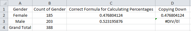
First, consider computing the appropriate percentages in a generic table in Excel (i.e., not within the pivot table framework). The appropriate formulas are given below.

Recall that Excel automatically updates the cell references in formulas when they are copied down and/or across cells. This can save LOTS of time in certain situations; however, it can also cause problems if you’re not careful. For example, suppose you entered the formula for Females and copied it down to obtain the percentage of Males.

After this formula is entered and copied down, a #DIV/0! error is produced. This happens because the denominator in our formula is cell B5, which is empty (and Excel treats this as a “0”). Since you cannot divide by 0, Excel returns the error.
Formula View:

Data View:
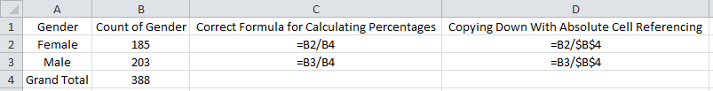
As discussed earlier, absolute cell referencing can be used to prevent this error from occurring. You can use the $ to force Excel to always use cell B4 in the denominator as shown below.
The final output…

Unfortunately, obtaining the appropriate percentages with calculations involving cells in the pivot table output is somewhat cumbersome because Excel refers to these cells in very specific ways. For example, the following “formula” is produced when you try to calculate a simple percentage of 185/388 with the pivot table output:

Question:
Copy this formula down to obtain the percentage of Males in this dataset. What happened? How do we fix the formula to obtain the correct percentage for Males?
1.10.3. Computing Percentages with the PivotTable
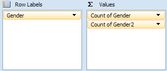
The PivotTable does have the ability to compute percentages automatically. The instructions below will result in a table containing both counts and their corresponding percentages.
When constructing the PivotTable, place Gender in the Values box twice.
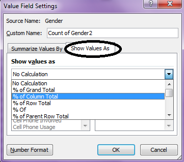
Your table should now contain two columns, as is shown here. Right-click on the column header for which you want to compute percentages and select “Value Field Settings…”
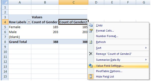
Under the Show values as tab, select % of Column Total from the drop-down list. Click OK.
The following table contains the desired outcomes.
| Gender | Count | Percentage |
|---|---|---|
| Female | 185 | 47.68% |
| Male | 203 | 52.32% |
| Total | 388 | 100.00% |
Exercise 2
- Compute the percentages for each level of the Cell Phone Involved variable.
- Compute the percentages for each level of the Cell Phone Usage variable.
1.10.4. Working with Two or More Variables…
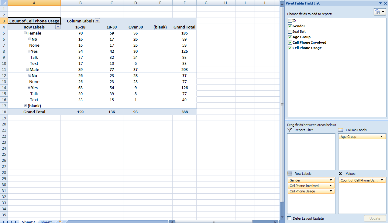
Suppose the goal is to understand the relationship between Gender and Cell Phone Involved. To create this pivot table, click on the space set aside for the pivot table and place Gender in the Column Labels box and Cell Phone Involved in the Row Labels box (note that if you click on the space set aside for the chart, you should place Gender in the Axis Field box and Cell Phone Involved in the Legend Fields box). Then, place either one of the variables in the Values box. Excel will calculate the counts by default.

The following table and graphic is produced. Again, the “Blank” category has been deselected since there are no missing values in our dataset.

You can change the Chart Type to a more traditional 100% Stacked Bar chart, which is similar to a mosaic plot.

Task:
Spend a few minutes to ‘clean up’ your 100% stacked bar chart to make it look like the one below.

Pivot tables can be used for as many variables as you’d like. However, you can easily become overwhelmed with too much information.
Exercise 3
- Create a table and graph that shows the percentages for all combinations of Age Group and Gender.
- Create a table that computes the percentages for all combinations of Age Group, Seat Belt, and Cell Phone Usage.
1.10.5. Pivot Tables with Numerical Data
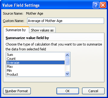
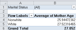
Next, open the NC_Birth.xlsx dataset. Suppose interest lies in the relationship between Mother Minority status and the age of a Mother at the time of birth. For example, do the data indicate that Nonwhite mothers tend to be of a younger age?
To investigate this, start by creating a pivot table with the following arguments.

Next, change the Value Field Settings on Mother Age so that Excel calculates the average age for each group.
The results are shown below.

Exercise 4
- Create a table that computes the average birth weight for each of the levels of the Kotelchuck index.
- Create a table that computes the average gestational age for babies that were and were not low birth weight.
1.10.6. Filtering with Pivot Tables
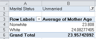
Consider the previous example. Suppose you also wanted to consider a third variable, Marital Status. You can add marital status to the Report Filter box:
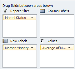
Now, you can click the drop-down arrow next to Marital Status in order to filter the results based on this variable.
For All:
For only the Married women:

For only the Unmarried women:
Exercise 5
Create the following PivotTable in Excel.
Create the table shown below using the output from your PivotTable.
Hints/functions used to create the table
Round()Concatenate()ISNUMBER()IF()
 |
 |