6.6. Data Management in R
For this handout, we will consider the Baby Name data this is provided by the Social Security administration. One goal of this handout is to consider regional differences in names. Thus, the State-specific data will be downloaded and used here. |
 |
American culture has several cases in which difference exist across regions, e.g. language, food, etc. We will investigate potential difference in baby names.
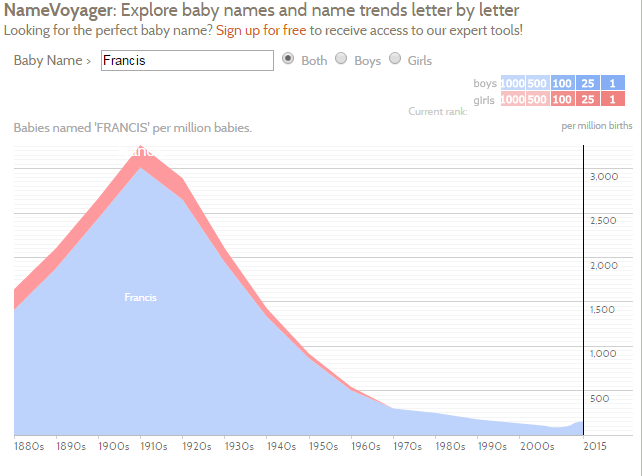
Source: http://www.babynamewizard.com/blog
The Name Voyager link on this website allows one to investigate how names change over time.
Trend for Francis over time
|
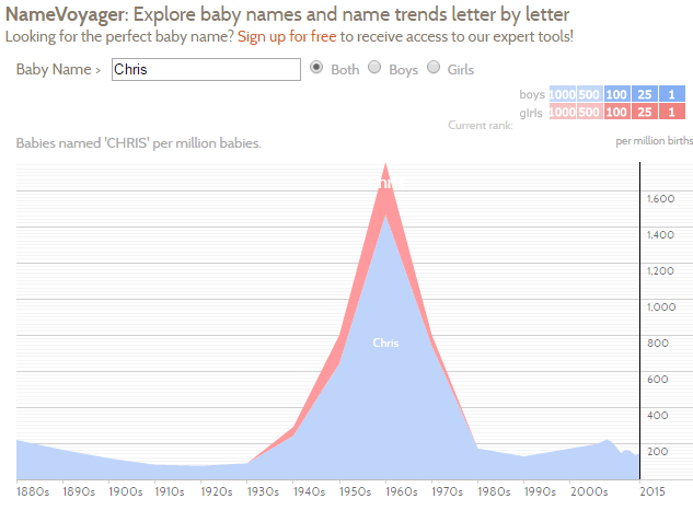
Trend for Chris over time
|
The Social Security Administration provides two datasets on their website. Regional differences are to be investigated here; thus, we will use the State-specific data. This file is somewhat larger than the National dataset.
Data: https://www.ssa.gov/oact/babynames/limits.html
After downloading this file, the file will need to be unzipped. Zipping a file is common for larger datasets. Several files are unzipped as is shown here.
Each data file is a text document. The contents of each line are separated by a comma. Thus when reading this file into R, we will specify comma delimited type.
The following code will automatically download this file, unzip the file, and combine all relevant datasets.
> #Reading in zip file that contains several files
>
> #Setup up directory and temporary file
> zipdir<-tempfile()
> temp<-tempfile()
>
> #Create directory
> dir.create(zipdir)
>
> #Downlaod the file, happens to be a zip file thus must be unpacked
> download.file(“https://www.ssa.gov/oact/babynames/state/namesbystate.zip”, temp, mode=”wb”)
>
> #Unzip the file
> unzip(temp, exdir=zipdir)
>
> #Get list of file contained in this directory, only bring in *.TXT files
> files <- list.files(zipdir, pattern=”\\.TXT$”)
>
> #Initialize a data.frame
> namedata<-data.frame()
> #Loop to read in files and concatenate them together via rbind
> for(i in 1:length(files)){
- filepath <- file.path(zipdir,files[i])
- temp <- read.csv(filepath,header=F)
- namedata<-rbind(namedata, temp)
- }
> #Unlink connection to directory
> unlink(zipdir)
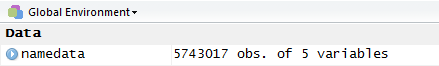
The full dataset has over 5 million observations and 5 variables.
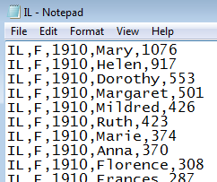
A snipit of the full dataset.
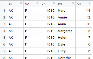
Notice that the names are generic. The names of a data.frame can be reassigned using the code provided below.
> names(namedata)
[1] “V1” “V2” “V3” “V4” “V5”
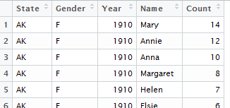
> names(namedata)<-c(“State”,”Gender”,”Year”,”Name”,”Count”)
> names(namedata)
[1] “State” “Gender” “Year” “Name” “Count”
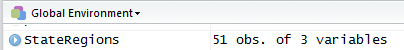
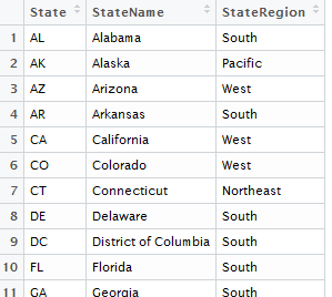
To investigate potential differences across regions, we must identify which states are contained with each region of the United States. The Census Bureau has specifically defined regions and these will be used here. These regions are contained in the StateRegions dataset. Load the StateRegions dataset into R.
> StateRegions <- read.csv(file.choose(), header=T, stringsAsFactors = TRUE)
This file has 51 observations (50 states + DC) and 3 columns.
Snipit of StateRegions dataset.
The next step is to merge the information from the StateRegions data with the namedata. This type of merge is called a left join. There are a variety of methods to join tables – details of these methods will not be discussed here.
namesdata
|
Merge Name and Region | StateRegions data
|
The dplyr package in R is convenient for the management of data. Download this package and load it into R.
The following single line of code is used to merge the two tables together.
> #Load the dplyr package
> library(dplyr)
>
> #Join the tables
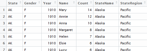
> namedata<-left_join(namedata,StateRegions)
Joining by: “State”
A view of the namesdata table after the merge. The namedata data.frame now contain the two additional columns.
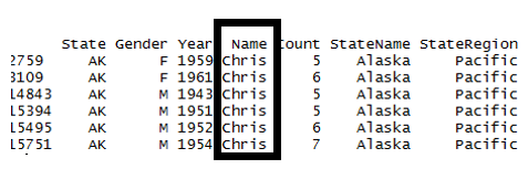
*Filtering Rows *The filter() function in dplyr allow you to easily filter out particular rows. Here, only rows that contain Chris are selected.
> #Obtain all rows that match Name == “Chris”
> Chris<-filter(namedata,Name == “Chris”)
Certainly, a filter can be obtained without the dplyr package, but dplyr does make common tasks easier.
> #Without dplyr
> Chris<-namedata[namedata$Name == “Chris”,]
The Chris data.frame contains 4090 observations and 7 variables.
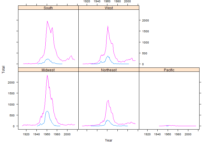
The following code will create a picture similar to the one provided by BabyVoyager when Chris is put into their search box. The display provided here breaks the data out amongst the four regions of the United States.
> #Obtain all rows that match Name == “Chris”
> Chris<-filter(namedata,Name == “Chris”)
>
> #Summarize Chris by Gender, Year, Region
> by_variable <- group_by(Chris,Gender,Year,StateRegion)
>
> output<-summarize(by_variable,Total=sum(Count))
The xyplot() in the lattice package allows the plotting to be done easily.
> library(lattice)
> xyplot(Total~Year|StateRegion, data=output,groups=Gender, type=”l”)
Questions:
- Based on these graphs, what is a type age for a person named Chris?
- Does there appear to be regional difference in baby’s named Chris? Discuss.
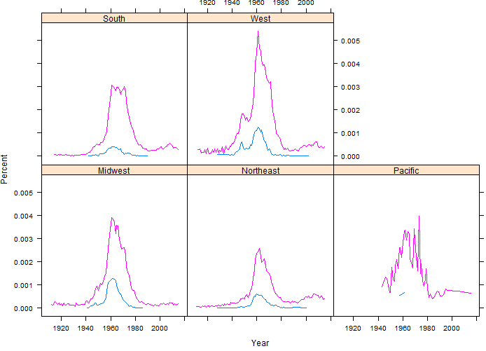
One drawback of the summaries provided above is that there is *not* and equal number of children born in the various regions in the United States. This is especially true for earlier years as the west very few people compared to the Northeast.
The following code will allow us to consider percent of baby names whose name is Chris. These percentages are computed within Gender, Year, and Region.
> #Summarize Gender, Year, Region
> by_variable <- group_by(namedata,Gender,Year,StateRegion)
>
> output2<-summarize(by_variable,Total2=sum(Count))
>
> #Join Chris to output2
> output3<-left_join(output,output2)
> #Get percent for Chris
> output3<-mutate(output3,Percent = Total/Total2)
>
> #Creating the plot
> xyplot(Percent~Year|StateRegion, data=output3,groups=Gender, type=”l”)
Questions:
- What information in conveyed in this plot that is not seen in the plot based on counts? Discuss.
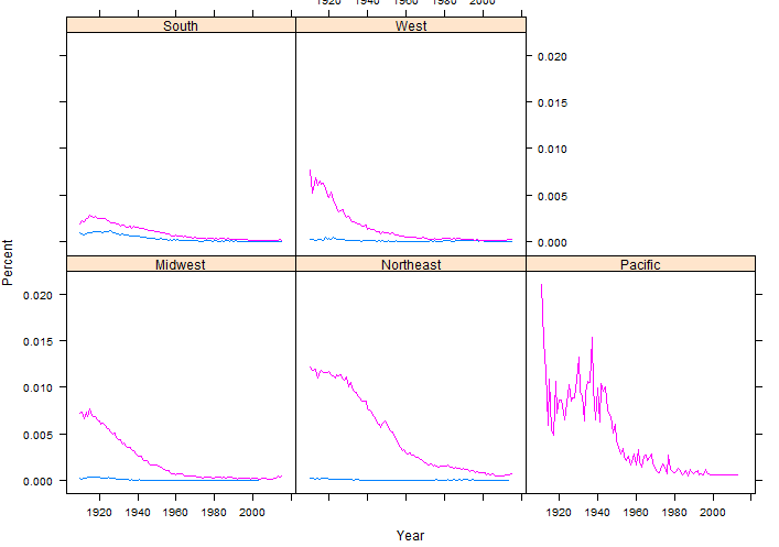
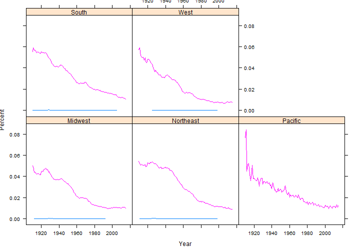
The following example investigates the name Francis. This name is much more common for males than females.
> #Obtain all rows that match Name == “Francis
> Francis<-filter(namedata,Name == “Francis”)
>
> #Summarize Francis by Gender, Year, Region
> by_variable <- group_by(Francis,Gender,Year,StateRegion)
>
> output<-summarize(by_variable,Total=sum(Count))
>
> #Joining Francis with output2, i.e. total counts
> output3<-left_join(output,output2)
Joining by: c(“Gender”, “Year”, “StateRegion”)
> output3<-mutate(output3,Percent = Total/Total2)
>
> #Create plot
> xyplot(Percent~Year|StateRegion, data=output3,groups=Gender, type=”l”)
Questions:
- What regional difference in baby’s named Francis?
- The Pacific plots appear to have a lot of variation compared to other regions. Why might this be the case?
The code has been rewritten so that any name can be easily investigated. Here simply change the assignment of the LookupName to whatever name you’d like.
> #Automating this process
> LookupName =”William”
> #Obtain all rows that match Name
> data<-filter(namedata,Name == LookupName)
>
> #Summarize Chris by Gender, Year, Region
> by_variable <- group_by(data,Gender,Year,StateRegion)
>
> output<-summarize(by_variable,Total=sum(Count))
>
> output3<-left_join(output,output2)
> output3<-mutate(output3,Percent = Total/Total2)
>
> xyplot(Percent~Year|StateRegion, data=output3,groups=Gender, type=”l”)
Questions:
- On the BabyName blog, the author suggested that William was more popular in the South than other regions. Does our investigation support this statement? Discuss.
- Is William gaining or losing popularity? Is this true for all regions?
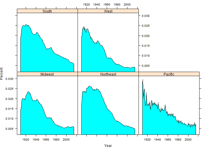
The following code will create a filled polygon similar to the one provided by NameVoyager. This code uses the latticeExtra package.
> #Obtain all rows that match Name == “William”
> William<-filter(namedata,Name == “William”)
>
> #Summarize William by Year, Region
> by_variable <- group_by(William, Year,StateRegion)
>
> output<-summarize(by_variable,Total=sum(Count))
>
>
> #Summarize Gender, Year, Region
> by_variable <- group_by(namedata,Year,StateRegion)
>
> output2<-summarize(by_variable,Total2=sum(Count))
>
> #Join Chris to output2
> output3<-left_join(output,output2)
> #Get percent for William
> output3<-mutate(output3,Percent = Total/Total2)
>
>
> library(latticeExtra)
> mypanel = function(x, y){
- panel.xyarea(x,y, fill=TRUE)
- }
>
> #Creating the plot
> xyplot(Percent~Year|StateRegion, data=output3, panel=mypanel)
The resulting plot.
*Task*
Complete the following task using the baby names dataset.
- How much regional differences exist in your name? Create an xyplot to investigate any differences.
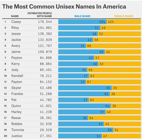
- Consider the following graphic which shows the most common unisex names in American. The names Casey, Riley, and Jessie top this list. Investigate the similarities in these names over time and across the four regions of the United States.